Photoshop process
I thought I'd speak to you about my process again, as I've just finished a new picture today and I thought that it might be interesting to someone to see how I go about arriving at a finished piece. Everyone has a different process, and most of the time I think that illustrators are self taught, as in my case. There are probably more effective ways of working, but over time I've fallen into doing things in a certain way. However, I'm always on the look out for any tips anyone might have that could save me time!
I wanted to do a personal work with bright, summery colours. So I started with a sketch on paper of a figure of a woman seated. I liked the pose and felt that I could make something of it so I scanned the pencil sketch and then drew a composition around it in photoshop using my wacom tablet. The figure sketch is quite tight at this stage, but the background is very loosely drawn. I did have a screenshot but I seem to have mislaid it - oops.
Once happy with the sketch I always start on the figure first. Apart from the skin tone I've no real idea of the colours I want to use at this stage.
So I use the pen tool, starting with the skin generally. I trace my sketch and then fill the shape with colour. Each different shape & colour is on it's own layer for easy editing afterwards. I do the same with the hair (above and below the skin layer in this picture). I'm not worrying about hair or skin tones much because I know I can adjust them later.
In the screenshot below, I've gone straight into working on the face. The shadow under the chin - infact all shadows are just black painted on a layer above which is set to 'soft light'. All I need to do then is adjust the opacity of the layer to get the shadow to the right intensity. If the shadow has to go on a really pale, light colour, I often duplicate the 'soft light' shadow layer but change it to 'colour burn' at a very low (10%) opacity. I find that this combination often gives me just the right looking shadow.
The lips are basically the same skin tone on a layer set to 'multiply'. I use a gaussian blur for the cheek blush.
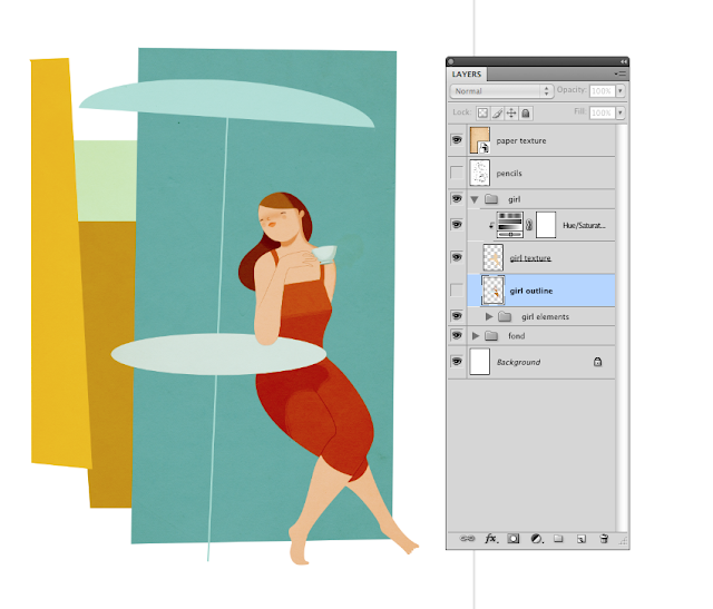
Here I'm sketching the hand again as I wasn't happy with my original sketch. I took a reference photo of my hand holding a teacup with photobooth (a very, very useful tool) and now I'm sketching it. I can't trace my hand in this case as it's not going to work with the illustration I think, I wanted a more stylized look to the hand.
Also you'll see I've added a dress layer above the skin.
You'll see below that I've changed the hair colour and dress colour. I've just applied an adjustment layer to each of the layers I wanted to change, and then spent a good half an hour sliding the hue and saturation bars up and down until I was happy. I knew that I wanted an orangey feel to the picture, so I've placed a warm coloured paper texture (set to colour burn) over the lady here which has helped to unify the colours. It's given the blue a kind of faded, retro look which I love too.
The lady's legs are defined by a simple line, drawn with the pen tool in black and then set to 'soft light' again.
Shadows really make all the difference. I spent a while on this one on her dress, but I think I got it looking okay. I'm not after a realistic shadow necessarily, rather a shape that works with the rest of the picture. Its not always the case, however, as it depends what I'm trying to do. For each little part of the picture I'm having to ask myself 'what am I trying to achieve with this colour, or shape or line', what purpose does it serve. It's like constant self editing.
So, now onto the main body of the illo. I spent a couple of hours playing with the colours of the background shapes until I was happy with them. I started laying down the background shapes all in orange and then went back and adjusted each one. I tried my best to resist the blue as I use it a lot in my work, but I felt it just needed to be a bluey/green behind the girl.
Below is the finished illustration. I've added lots more shadow, a little bit of texture and a few more details. Also, I've added a layer of black over the entire picture, set it to soft light, and then applied a layer mask. Then, using the gradient tool (the one that does circles - I forget the name) I pick out areas in the picture that I want to highlight, like her face, her knees, and the man's back leg.
Originally I wanted the man to be walking towards the lady, up a flight of steps, but later felt it might be more interesting to have one figure seen from the front and one from behind, to just a little bit of contras. I think that any contrasts, in size, colour and mark making too, can add a bit of dynamism to a picture.


 Below is the finished illustration. I've added lots more shadow, a little bit of texture and a few more details. Also, I've added a layer of black over the entire picture, set it to soft light, and then applied a layer mask. Then, using the gradient tool (the one that does circles - I forget the name) I pick out areas in the picture that I want to highlight, like her face, her knees, and the man's back leg.


