A new personal illustration on my site www.lyonsa.com
samedi 25 août 2012
jeudi 2 août 2012
Photoshop process
I thought I'd speak to you about my process again, as I've just finished a new picture today and I thought that it might be interesting to someone to see how I go about arriving at a finished piece. Everyone has a different process, and most of the time I think that illustrators are self taught, as in my case. There are probably more effective ways of working, but over time I've fallen into doing things in a certain way. However, I'm always on the look out for any tips anyone might have that could save me time!
I wanted to do a personal work with bright, summery colours. So I started with a sketch on paper of a figure of a woman seated. I liked the pose and felt that I could make something of it so I scanned the pencil sketch and then drew a composition around it in photoshop using my wacom tablet. The figure sketch is quite tight at this stage, but the background is very loosely drawn. I did have a screenshot but I seem to have mislaid it - oops.
Once happy with the sketch I always start on the figure first. Apart from the skin tone I've no real idea of the colours I want to use at this stage.
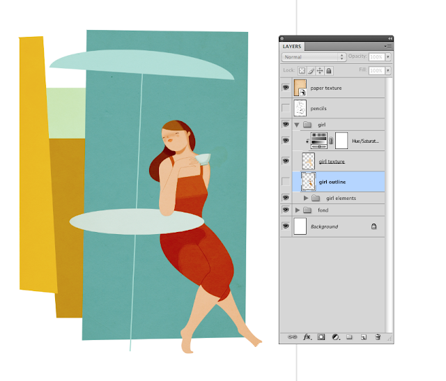
So I use the pen tool, starting with the skin generally. I trace my sketch and then fill the shape with colour. Each different shape & colour is on it's own layer for easy editing afterwards. I do the same with the hair (above and below the skin layer in this picture). I'm not worrying about hair or skin tones much because I know I can adjust them later.
In the screenshot below, I've gone straight into working on the face. The shadow under the chin - infact all shadows are just black painted on a layer above which is set to 'soft light'. All I need to do then is adjust the opacity of the layer to get the shadow to the right intensity. If the shadow has to go on a really pale, light colour, I often duplicate the 'soft light' shadow layer but change it to 'colour burn' at a very low (10%) opacity. I find that this combination often gives me just the right looking shadow.
The lips are basically the same skin tone on a layer set to 'multiply'. I use a gaussian blur for the cheek blush.
Here I'm sketching the hand again as I wasn't happy with my original sketch. I took a reference photo of my hand holding a teacup with photobooth (a very, very useful tool) and now I'm sketching it. I can't trace my hand in this case as it's not going to work with the illustration I think, I wanted a more stylized look to the hand.
Also you'll see I've added a dress layer above the skin.
You'll see below that I've changed the hair colour and dress colour. I've just applied an adjustment layer to each of the layers I wanted to change, and then spent a good half an hour sliding the hue and saturation bars up and down until I was happy. I knew that I wanted an orangey feel to the picture, so I've placed a warm coloured paper texture (set to colour burn) over the lady here which has helped to unify the colours. It's given the blue a kind of faded, retro look which I love too.
The lady's legs are defined by a simple line, drawn with the pen tool in black and then set to 'soft light' again.
Shadows really make all the difference. I spent a while on this one on her dress, but I think I got it looking okay. I'm not after a realistic shadow necessarily, rather a shape that works with the rest of the picture. Its not always the case, however, as it depends what I'm trying to do. For each little part of the picture I'm having to ask myself 'what am I trying to achieve with this colour, or shape or line', what purpose does it serve. It's like constant self editing.
So, now onto the main body of the illo. I spent a couple of hours playing with the colours of the background shapes until I was happy with them. I started laying down the background shapes all in orange and then went back and adjusted each one. I tried my best to resist the blue as I use it a lot in my work, but I felt it just needed to be a bluey/green behind the girl.
 Below is the finished illustration. I've added lots more shadow, a little bit of texture and a few more details. Also, I've added a layer of black over the entire picture, set it to soft light, and then applied a layer mask. Then, using the gradient tool (the one that does circles - I forget the name) I pick out areas in the picture that I want to highlight, like her face, her knees, and the man's back leg.
Originally I wanted the man to be walking towards the lady, up a flight of steps, but later felt it might be more interesting to have one figure seen from the front and one from behind, to just a little bit of contras. I think that any contrasts, in size, colour and mark making too, can add a bit of dynamism to a picture.
dimanche 27 mai 2012
mardi 15 mai 2012
lundi 23 avril 2012
Here's a piece I did for the Secret 7" exhibition and sale that took place in London last weekend, with all proceeds of artwork sold going to Teenage Cancer Trust. There were 700 pieces of artwork, 7" vinyl sleeves, all inspired by one of 7 songs by 7 Universal music artists. I chose to illustrate the Florence + The Machine song, 'Only if for a night'. I took a fairly liberal take on the meaning of the song, just concentrating on a couple of the images from the lyrics.
Below the final piece is my original digital sketch.
Below the final piece is my original digital sketch.
jeudi 5 avril 2012
Google Think Quarterly
I've just added a new couple of illustrations to my online portfolio that were commissioned for the latest issue of Google's Think Quarterly, an online and print publication. Here's one of the illustrations:
And below are a few small roughs for this image, click for a larger view:
And below are a few small roughs for this image, click for a larger view:
mardi 27 mars 2012
Jungle illustration and process
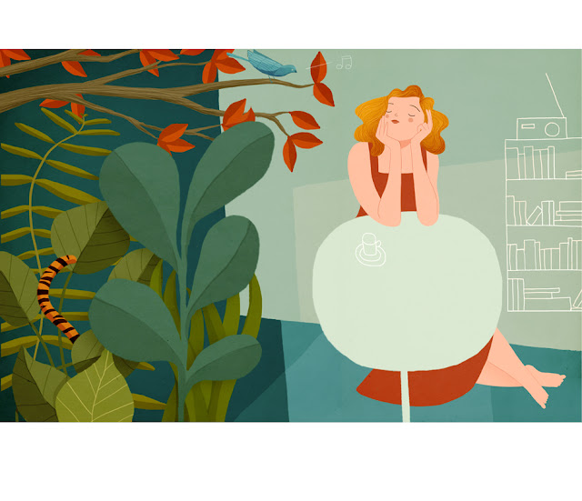
This morning I finished a new personal illustration, based on an idea I had of a kitchen filled with potted plants turning into a jungle in a daydream. 
I started with a very rough sketch in photoshop (normally I sketch in pencil first, but this time it just seemed easier to delete and edit as I didn't know really what I wanted). After an hour or so of sketching and deleting, I had arrived at the sketch below.

I started with a very rough sketch in photoshop (normally I sketch in pencil first, but this time it just seemed easier to delete and edit as I didn't know really what I wanted). After an hour or so of sketching and deleting, I had arrived at the sketch below.
I knew by looking at the sketch that I would run into problems when it came to coloring the girl at the table, as my lines are very rough and I hadn't drawn the hands clearly. A clear pencil drawing really makes the difference at the photoshop stage, so I took a pencil and paper and re-drew the daydreaming lady.
Her hair changes in this sketch, which wasn't planned, I just drew it as a preliminary squiggle and hesitated before rubbing it out when I saw that it looked ok. That's what's I find is much fun about drawing pictures, the element of mystery about it. I can have a vague idea of what I want but I'm always surprised buy something that happens along the way. They are not all good surprises though.
Here I've started to colour the background and I've added a paper texture, which I find really adds some nice contrast to the image, and a hint of orangey/brown over the picture helps the different colours to work together.
I tend to try and keep my colour palette small, as it's so difficult to work with more than two or three basic colours. I generally choose one warm and one cool colour and then work with variations on those.
This is the illustration almost finished. I left it like this overnight and then came back to work on it the next morning. I felt that the bookcase wasn't working where it touches the ground, so I deleted a bit of that. I also added a tiger's tail to get a bit of orange into the bottom left, balancing the orange of the girls hair and helping to draw the eye into the foliage.
vendredi 23 mars 2012
Trumpet
Here's a quick picture I did this morning. I'm thinking of using this trumpet guy as a character in a narrative I'm working on.
vendredi 16 mars 2012
Old and New project
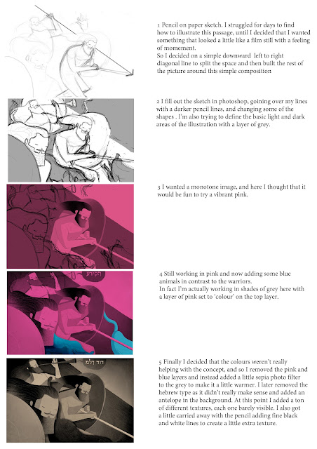
Below is my contribution to the Old and New project: http://oldandnewproject.com A website that invites illustrators and designers to interpret a biblical passage. I'm not a believer but I've found it an interesting challenge. I was given a passage from 1 Chronicles 12 verse 8 to illustrate.
I've also put together a short description of the process that went into creating the image.
I've also put together a short description of the process that went into creating the image.
mardi 6 mars 2012
windy day
It feels like ages since I last posted some work, so today I took a couple of hours to do a picture. Some bright colours for a grey windy day.
lundi 13 février 2012
dimanche 12 février 2012
mardi 31 janvier 2012
Avenue magazine
Welcome to my new blog. Here I'll be showing sketches and bits and pieces of my works in process where I can. But I thought that for my first post I'd show some finished work.
Underneath is the rough drawing for this piece, which in this case is very close to the final. In order to create a montage that was a little different, I tried breaking up different scenes and then re-arranging them like a jigsaw that had gone a bit wrong, but that gave an interesting design. I quite like it when parts of the picture break out from the edges of their background shapes.
Inscription à :
Articles (Atom)


